Communicating Bias
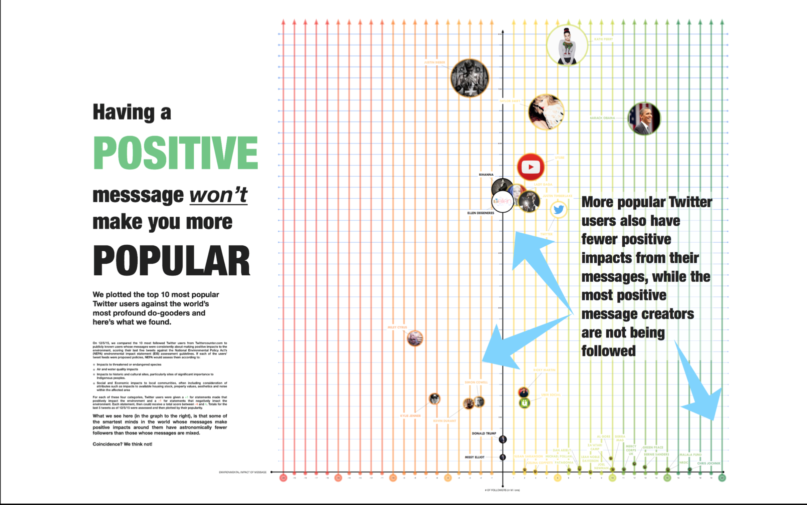
When asked to communicate how two opposing conclusions could be expressed through the same data set, I visualized the correlation of “positive” content of Twitter users and their popularity. Click on the image to enlarge it.
While both visualizations are based on real data, neither of them are true–this is why we build a study to find the information we need instead of inferring what we want to be true from large data sets.

